
The new FC logo
Moderators: Starfleet Security, Federation Council, Office of Propaganda

The new FC logo
Inspired by the original. This shall be our new official standard. Any resemblance to the UFP logo is coincidental, as I designed that one also.


Re: The new FC logo
A majestic piece of work, Jesse. Worthy of your talents.
Your first draft was not bad either
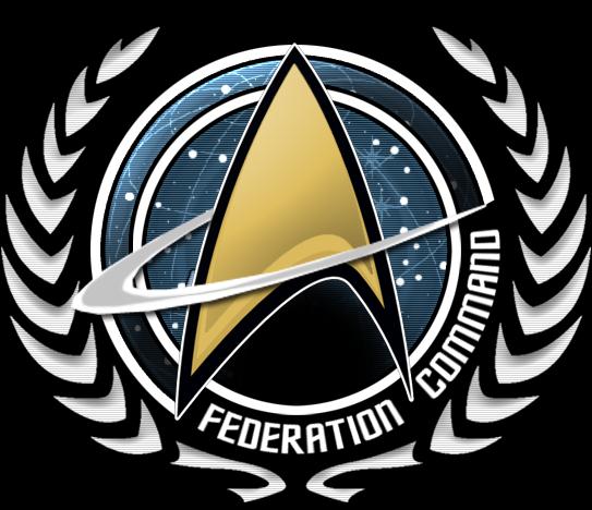
Your first draft was not bad either
Thank you,

-
Silverado
- Lieutenant Commander

- Posts: 1496
- Joined: May 21st, 2011, 2:22 am
- STO Handle: @silverado_679
- Location: Las Vegas, NV
- Contact:
Re: The new FC logo
I like it !
now for some feedback i think the red line that swoops around from the back on the first one and the white line that swoops around from the back on the second one should have like a federation ship at the end of it like the ship was flying around out logo
what do you think ???
now for some feedback i think the red line that swoops around from the back on the first one and the white line that swoops around from the back on the second one should have like a federation ship at the end of it like the ship was flying around out logo
what do you think ???


-
Heero Yuy
- Captain

- Posts: 216
- Joined: May 22nd, 2011, 1:51 pm
- Location: East Stroudsburg, PA
- Contact:
Re: The new FC logo
I think they both look cool, Silverado that would be a little hard I thinksilverado wrote:I like it !
now for some feedback i think the red line that swoops around from the back on the first one and the white line that swoops around from the back on the second one should have like a federation ship at the end of it like the ship was flying around out logo
what do you think ???
Re: The new FC logo
Yeah I think that could be a good idea if we made a banner of a graphic but this is the plain and simply FC logo. When we start creating graphics we could add stuff like this.
Thank you,

-
GiancarloCC
- Visitor

- Posts: 24
- Joined: January 23rd, 2012, 4:00 am
- STO Handle: @GiancarloCadengue
- Contact:

-
Shroombuck
- Rear Admiral

- Posts: 2380
- Joined: May 23rd, 2011, 11:10 am

